

Pattern and Path logo

PATTERN & PATH

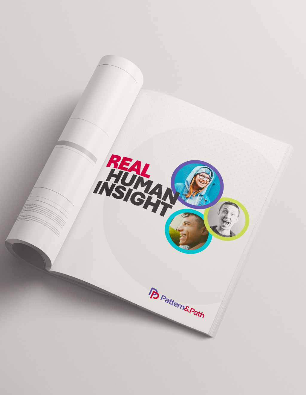
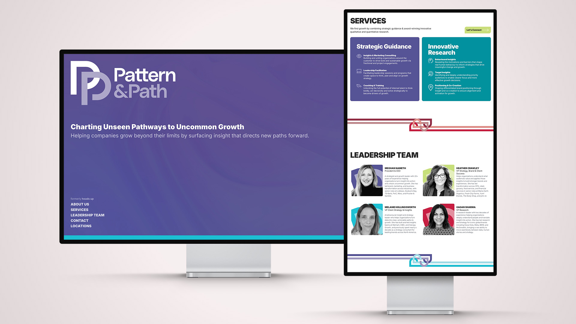
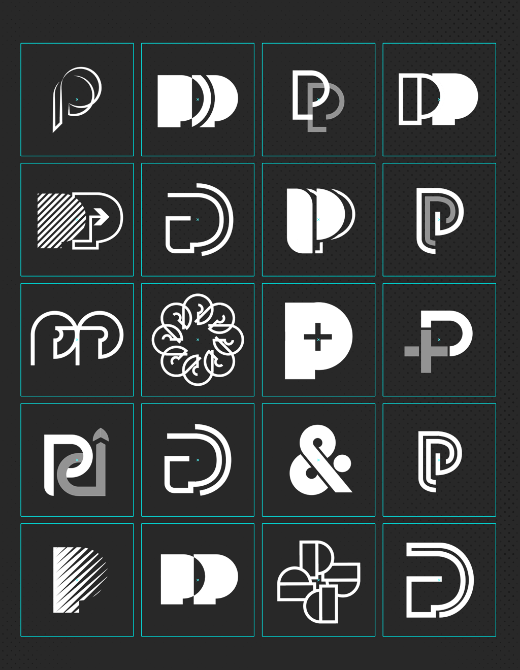
After several years of working together, HeadsUP Group decided that it was time for a re-brand. Outhouse Creative was tasked with creating a new, fresh visual identity. A look and feel that felt more "human" and approachable. It started with a name then evolved into a colourful, warm and approachable brand and eventually a new website.
PROJECT TYPE
BRANDING & IDENTITY
ROLE
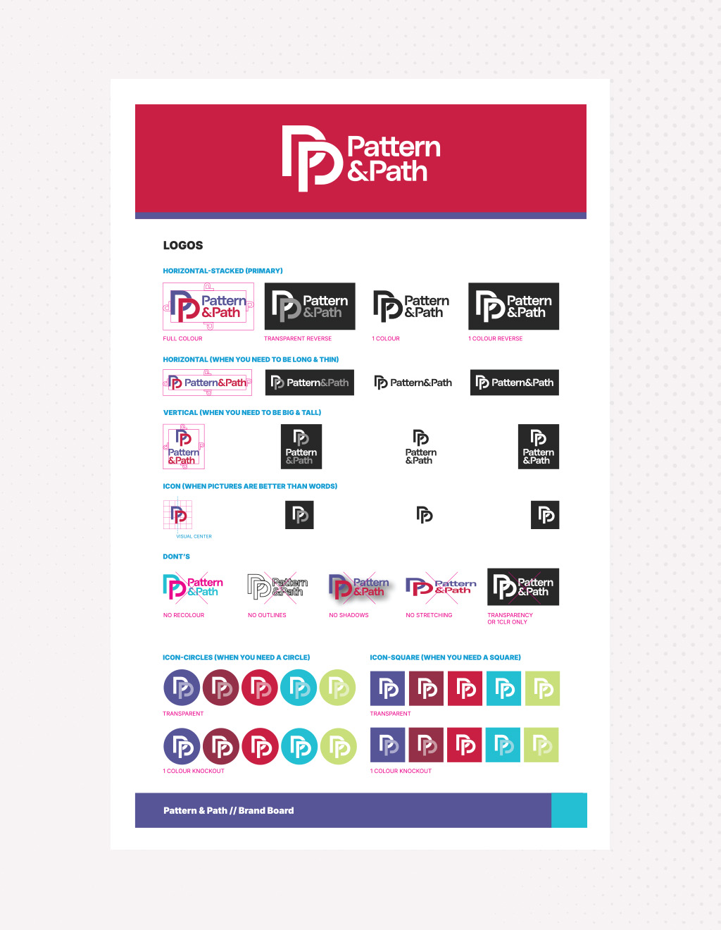
CREATIVE DIRECTION, ART DIRECTION, VISUAL IDENTITY, BRAND STANDARDS
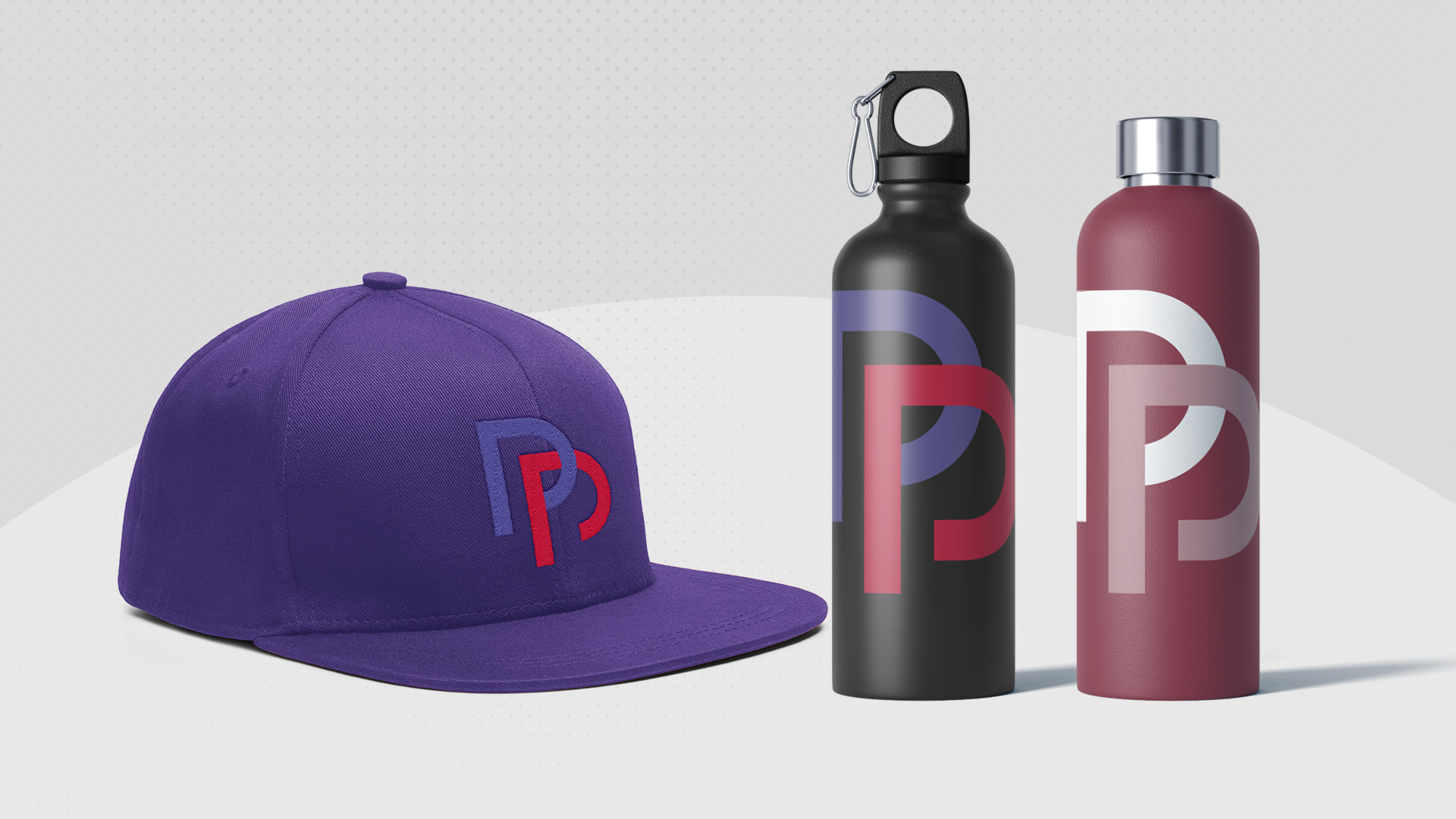
Pattern & Path’s visual identity has evolved from a polished consultancy presence into a more modern expression of insight in motion. A flexible, energetic system—bold colour, expressive typography, candid human imagery and purposeful pathways—bring warmth and momentum to the brand.

It should make research feel less remote, strategy more collaborative, and growth more tangible: a living identity that reflects the curiosity, empathy and decisive action behind every uncommon path forward for clients today.
Outhouse Creative’s new visual identity brings a welcome burst of brightness and colour to the marketing research space, transforming a traditionally technical category into one that feels open, optimistic and alive. For Pattern & Path’s clients, the system creates an immediate sense of humanity: it foregrounds people, emotion and possibility alongside rigorous insight. The result is a distinctive, approachable brand experience that makes strategic growth feel personal, collaborative and energising.